Skip to content

NDIS website design, branding and SEO for SplexCare

Brand and website for a new Melbourne NDIS provider, from a logo built on the building blocks of life to copy that makes reaching out for support feel easy.

Visit the live website
Industry
NDIS support
Location
Melbourne
Year
2026
Services
  • Website design and development
  • Logo and brand identity
  • Brand voice and copywriting
  • SEO and AI search visibility
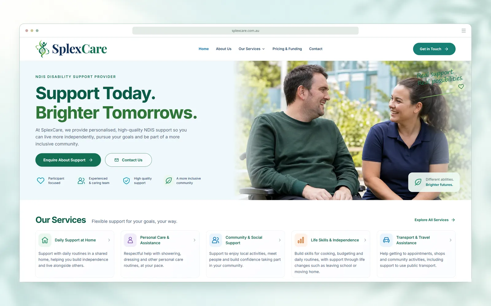
SplexCare homepage screenshot in a desktop browser frame, with the heading Support Today. Brighter Tomorrows. beside a photo of a wheelchair user and a support worker in a garden

More people finding SplexCare and reaching out

Visitors from search and AI
+86%
The work behind it:Structured data, page titles written for the questions people search, and every page open to AI crawlers.
Monthly enquiries
+23%
The work behind it:Plain-English descriptions of every support, each with a direct link to ask about it, and pages that answer cost and safety questions up front.

Growth over our first three months working with SplexCare. Visitors are people arriving from Google search results and from links in AI tools such as ChatGPT, measured with Google Search Console and Cloudflare Analytics. Enquiries are the calls, emails and messages SplexCare received per month, compared before and after those three months, as reported by its owner.

Planning a website for your organisation?

Talk to our Melbourne team

Building trust for a new NDIS provider

SplexCare is a new NDIS support provider working across Melbourne's north and west, offering ten supports from daily living and personal care to employment, housing and nursing. From the first conversation, we built its brand and website to do three jobs: earn the trust of people meeting SplexCare for the first time, explain every support plainly, and turn first visits into enquiries.

Who the site is for

  • Participants

    What they need

    To understand what support would look like, without needing to know NDIS terms first.

    What the site gives them

    Plain-English descriptions of all ten supports, each with its own icon and a direct link to ask about it.

  • Families

    What they need

    To know who they'd be dealing with, what support would cost and how their family member would be protected.

    What the site gives them

    An about page, a pricing and funding page, and one page covering rights, complaints and worker screening.

  • Support coordinators

    What they need

    To refer someone quickly and confirm SplexCare covers their area.

    What the site gives them

    A referrals section with a checklist of the details to include, and the service area and reply time shown wherever people get in touch.

Listening before designing

As a new provider, SplexCare didn't have years of word of mouth behind it, so for many people its website would be their first impression.

Asking for disability support is a personal step. People want to know who they'd be dealing with and what support would look like before they get in touch.

The wording mattered as much as the design. Jargon and corporate phrasing can leave people feeling they need the right terms before they're allowed to ask a question.

The site had to explain ten different supports plainly and make reaching out feel like the easy part.

We started with conversations, not mock-ups. We asked SplexCare about:

  1. The people it supports
  2. Its purpose and values
  3. How it wanted someone to feel when they found it online

How visitors should feel

Welcome, respected and comfortable asking questions.

That feeling became the brief for everything that followed, so the brand and website grew out of SplexCare's own identity rather than a template.

A logo built from the building blocks of life

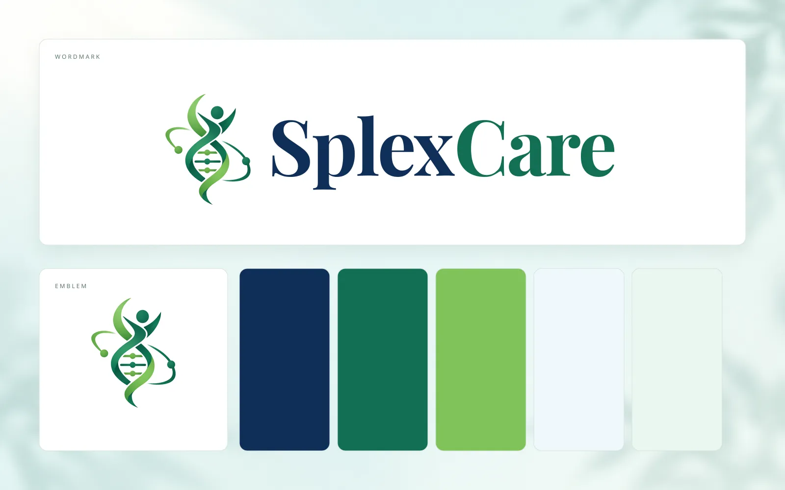
SplexCare wanted its logo to represent the building blocks of life, so we brought them together in a single emblem.

SplexCare brand sheet with the DNA helix emblem beside the navy and emerald SplexCare wordmark, above the emblem on its own and navy, emerald, leaf green, pale blue and mint colour swatches

Reading the emblem

The building blocks
A DNA double helix and the sweeping orbits of an atom.
Life
A figure with raised arms, rising out of the helix.

Refined together

We developed the emblem with SplexCare over several rounds of feedback, refining the design each time until SplexCare was ready to put its name to it.

The rest of SplexCare's identity grew from the emblem:

  • Wordmark

    The emblem beside SplexCare in navy and emerald serif lettering, converted to outlines so it renders the same everywhere.

  • Square logo

    A square version for Google and other platforms that show a logo on its own.

  • Favicon

    A small version that keeps the emblem recognisable in a browser tab.

A brand voice that makes asking easy

We wrote the website in a voice that is welcoming, clear, supportive and human, so it reads like a conversation with SplexCare's team and keeps the reader's choices at the centre.

From the services page

“Your life. Your goals. Support that fits.”

Opening the step-by-step guide

“You don't need to have everything figured out.”

That line takes the pressure off a first enquiry, and the descriptions of all ten supports are written with the same care. Each one:

  1. Uses everyday language.
  2. Speaks directly to the person reading.
  3. Explains what's on offer without asking anyone to know NDIS terminology first.

“We appreciate that AzimuthWeb took the time to understand us and kept listening as the project developed. Their contribution reached beyond building the pages: they helped us find a clearer way to express who we are.”

SplexCareNDIS support provider, Melbourne

A calm website that answers people's first questions

Our website design and development work gave SplexCare a site organised around what people want to know before they reach out.

At launch

A services page
Covering all ten supports, each with a plain description, what it includes and a direct link to ask about it.
An about page
Sharing SplexCare's mission, vision and values, so people get a sense of who they'd be working with.
A step-by-step guide
Showing what happens after someone gets in touch, from an introductory chat to support starting.
A contact page
For people asking for themselves or for someone they support, with phone, email, office hours and an enquiry form that goes straight to SplexCare's inbox.
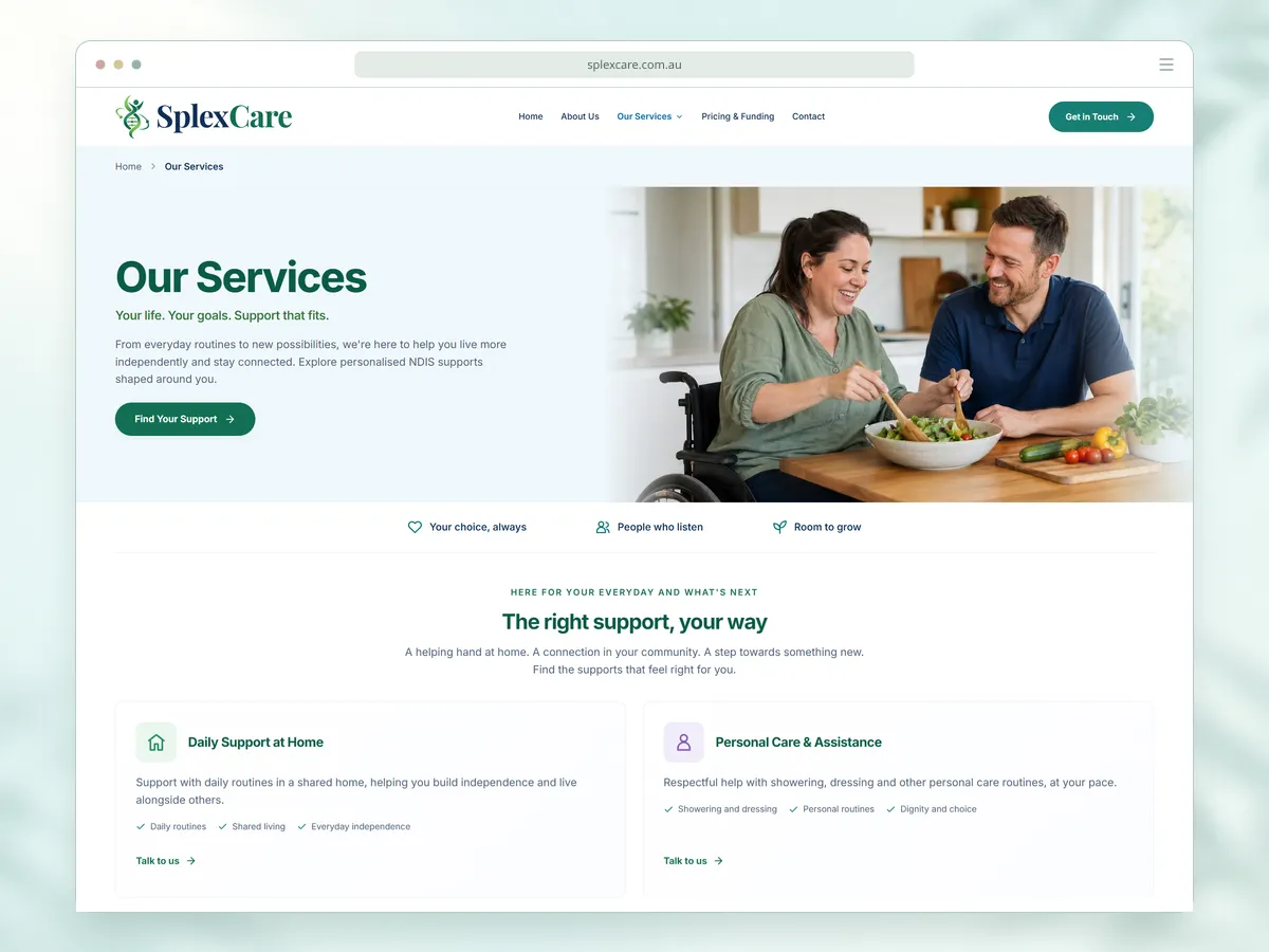
SplexCare services page in a desktop browser frame, with a participant and support worker preparing a meal above cards for daily support at home and personal care
The services page, opening on an everyday moment

A calm, approachable design

We chose the colours, imagery and spacing alongside the words, so the first impression would feel approachable, positive and trustworthy: soft blues and greens, photos of participants and support workers sharing everyday moments, and generous spacing that gives people room to read at their own pace.

Easy to scan on a phone

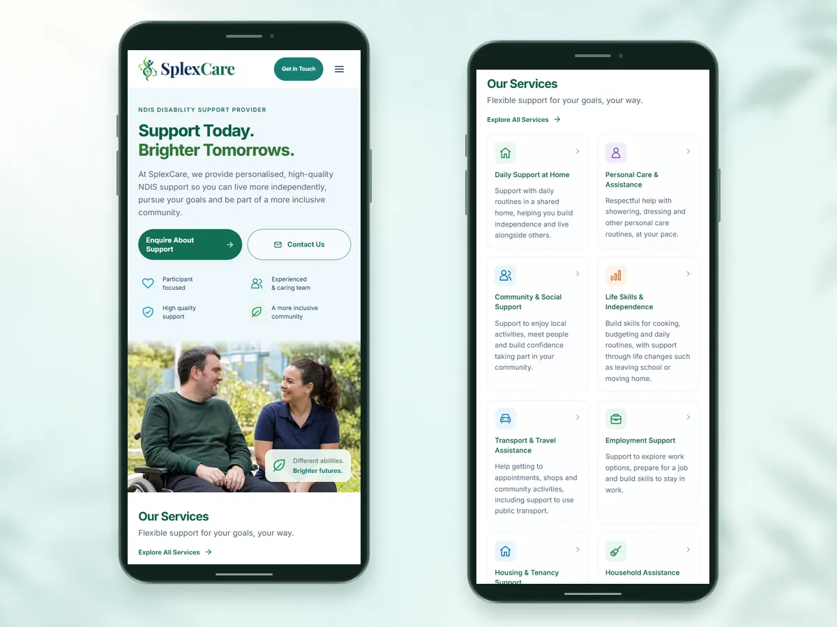
The site is lightweight and works well on a phone. Each support has its own icon and colour, so someone looking for help with transport or housing can spot it quickly.

Two phone frames showing the SplexCare mobile homepage hero and its list of supports, each with its own coloured icon
Each support's icon and colour on a phone

Accessible, private and secure

As a disability support provider, SplexCare needs a website that works for everyone who visits and treats personal information with care.

  • Accessible

    Readable text and clear navigation, with menus and forms that work with a keyboard and form errors that explain what to fix.

  • Private

    A plain-English privacy policy covering website enquiries and participants' personal and health information. No page carries advertising or tracking scripts, so someone's search for support is never shared with advertisers.

  • Secure

    A security policy that blocks every script except the site's own and the enquiry form's spam check, so injected code can't run where people share personal details. The form also limits repeated submissions, and security reports go to a published contact.

Tested with Google Lighthouse

100 in every category

Performance
100
Accessibility
100
Best practices
100
SEO
100

Discoverable on Google, ChatGPT and Claude

Our SEO work made sure Google and AI tools such as ChatGPT, Claude and Perplexity can find SplexCare's website and understand what it offers.

For search engines

The site gives search engines the details they rely on:

Structured data
Describing SplexCare, each page and all ten supports, so search engines can connect every service to the organisation behind it.
Page titles and descriptions

Written for the question each page answers, such as:

splexcare.com.au/rights-and-safety

Your Rights & Safety | Feedback and Complaints | SplexCare

How to give feedback or make a complaint to SplexCare, contact the NDIS Quality and Safeguards Commission, and how we screen our workers and protect your information.

Sitemap
Helping search engines find every public page.

For AI tools

  • ChatGPT
  • Claude
  • Perplexity

Every page is open to AI crawlers, and the same structured data and pages give them the facts Google sees. We also added an llms.txt file, a guide written for AI tools. It summarises SplexCare, points to the pages on its supports, pricing, referrals and rights, and asks AI tools to cite the relevant page when they answer questions about SplexCare.

In practice

ChatGPT has recommended SplexCare to people looking for NDIS support.

SplexCare's owner has confirmed these recommendations, and visitors who click through from AI tools are counted in the 86% rise in visitors from search and AI.

Answering the questions that come next

Once people know what SplexCare offers, they want to know about cost, safety and how to get started. Since launch, we've added pages that answer those questions directly, so people now get in touch better informed and their enquiries focus on arranging support rather than finding answers.

Added since launch

Pricing and funding
A page in the main menu covering NDIS price limits and plan-managed, self-managed and private funding, so people can check costs before they ask.
Rights and safety
One page for feedback, complaints, the NDIS Commission and worker screening, so people can see how they'd be protected before choosing a provider.
Referrals
A section for support coordinators and families, with a checklist of the details to include.
Area and reply time
Shown wherever people get in touch, so they know whether SplexCare covers their area and when to expect a reply.
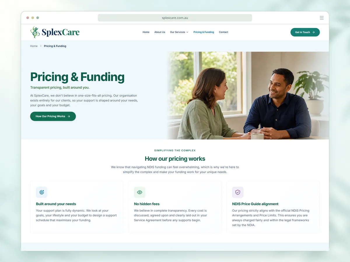
SplexCare pricing and funding page in a desktop browser frame, with two people talking across a table beside its promise of transparent pricing, above cards for support plans built around each person's needs, no hidden fees and NDIS Price Guide alignment
The pricing and funding page, explaining costs upfront

Today, SplexCare has a brand with a story behind it and a website that welcomes people the way its team would in person.

We continue to host the site, keep its software up to date and add to it as the organisation grows.

Visit the live websitesplexcare.com.au

“We would recommend AzimuthWeb to an organisation looking for a team that listens, welcomes feedback and cares about how the finished website serves its visitors.”

From SplexCare's website story

More projects

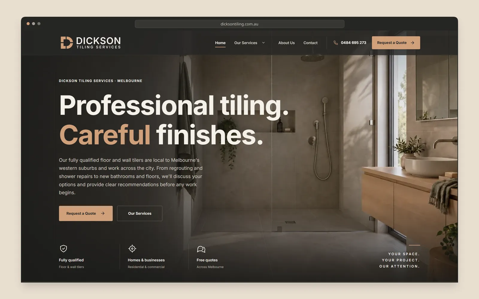
  • Dickson Tiling Services homepage screenshot in a desktop browser frame, with the heading Professional tiling. Careful finishes. over a tiled bathroom and a Request a Quote button

    Tiling · Melton, Melbourne

    Dickson Tiling Services

    A logo, brand voice and website for a Melton tiling business, rebuilt around the jobs its customers search for and refined since launch.

    Impressions in Google search results
    +151%
    New visitors to the website
    +92%

    Growth in our first three months

    View case study: Dickson Tiling Services
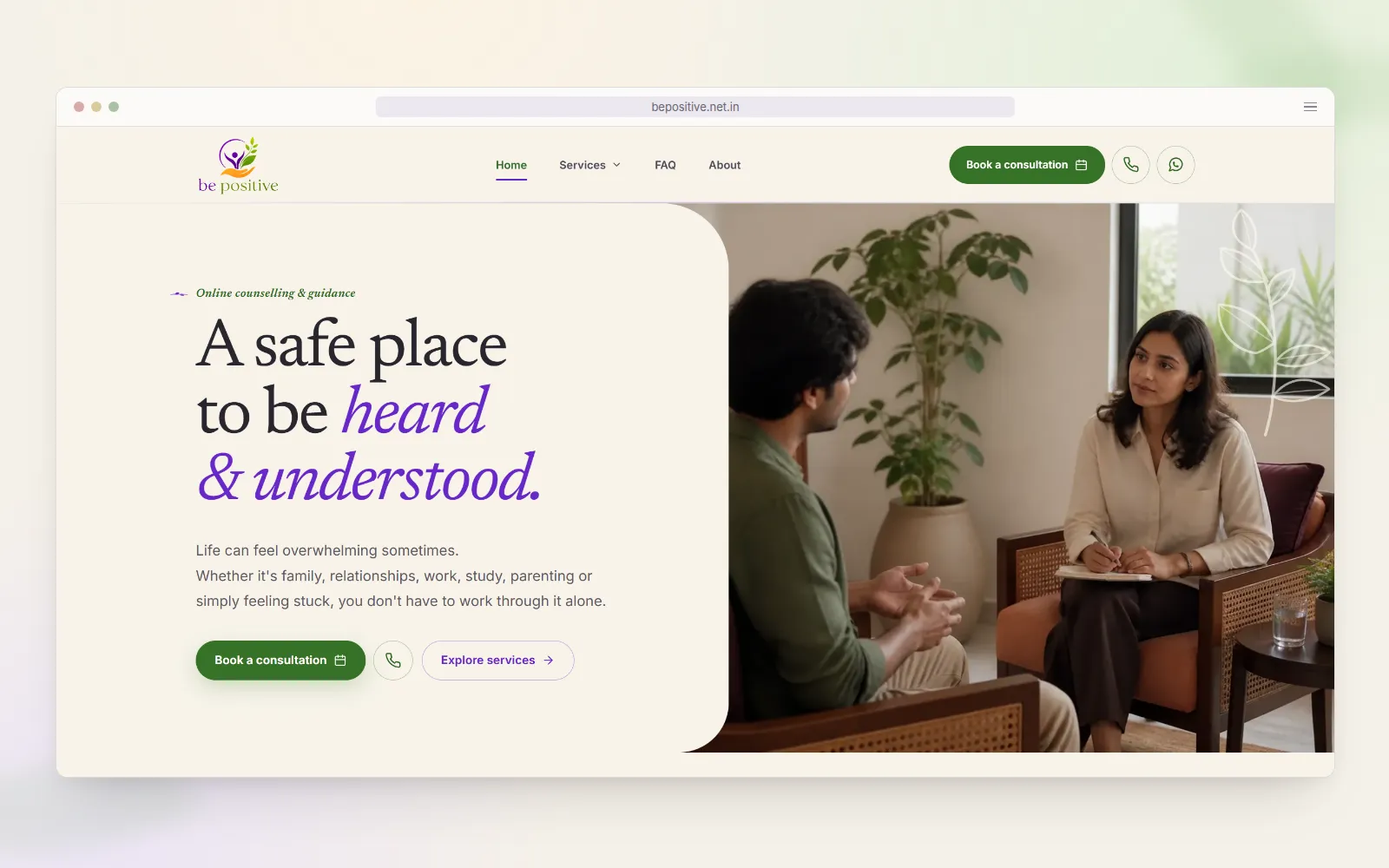
  • Be Positive homepage screenshot in a desktop browser frame, with the heading A safe place to be heard & understood. beside a photo of a counsellor listening to a client in a calm, plant-filled room

    Counselling · Brisbane, International

    Be Positive

    A refreshed logo and a calm website for an online counselling practice, built so the people it can help find it and reach out on WhatsApp, its preferred channel.

    Genuine client enquiries
    +90%
    Visits to the website
    +130%

    Growth in our first three months

    View case study: Be Positive
See all our work

Want a brand people trust from the first visit?

Tell us what your organisation stands for and the people you want to reach. We'll reply with practical next steps, usually within one Australian business day.