Counselling website design, branding and SEO for Be Positive
A refreshed logo and a calm website for an online counselling practice, built so the people it can help find it and reach out on WhatsApp, its preferred channel.
The work behind it:A sticky bar that keeps WhatsApp, the practice's preferred way to hear from new clients, one tap away on phones, chosen after a four-week A/B test.
Visits to the website
+130%
The work behind it:Pages written around the support people look for, structured data describing the practice and each service, and every page open to search engines and AI tools.
Visitors from the areas it works in
98%
The work behind it:Language and region settings, structured data naming the area it serves, and local details such as opening hours and urgent-help numbers.
Enquiries and visits compare our first three months working with Be Positive with the three months before. Back then, the site drew visitors from all over the world. Now 98% of them come from the areas Be Positive works in.
Be Positive is an online counselling and guidance practice built on 20 years of supporting people in person: individuals, students, couples and families. As it moved its work online, we refreshed its logo and built a calm new website around one aim: helping the people it can support find it, feel at ease and reach out the way it prefers.
01Logo refresh
A logo that lives up to its name
Be Positive came to us with a logo of its own. Rather than replace it, we kept the parts the practice already knew and redrew the rest, so the logo now carries the hope in its name.
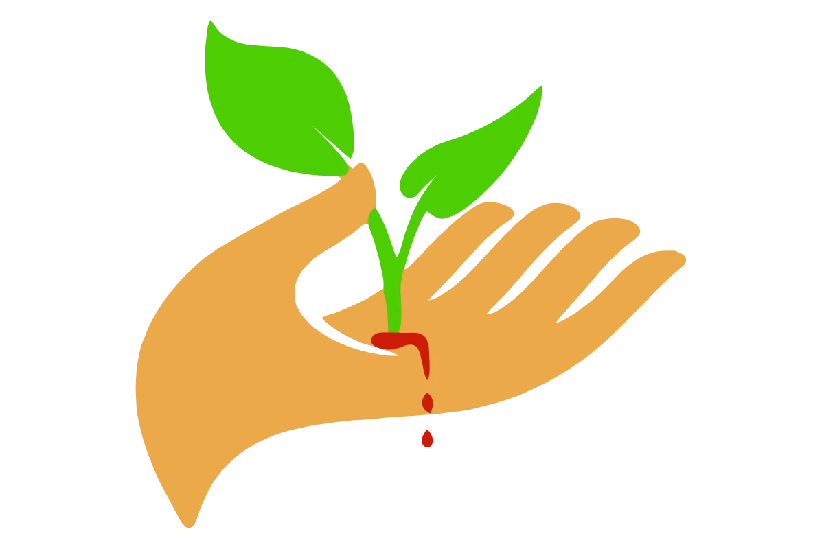
Before: The logo Be Positive came with
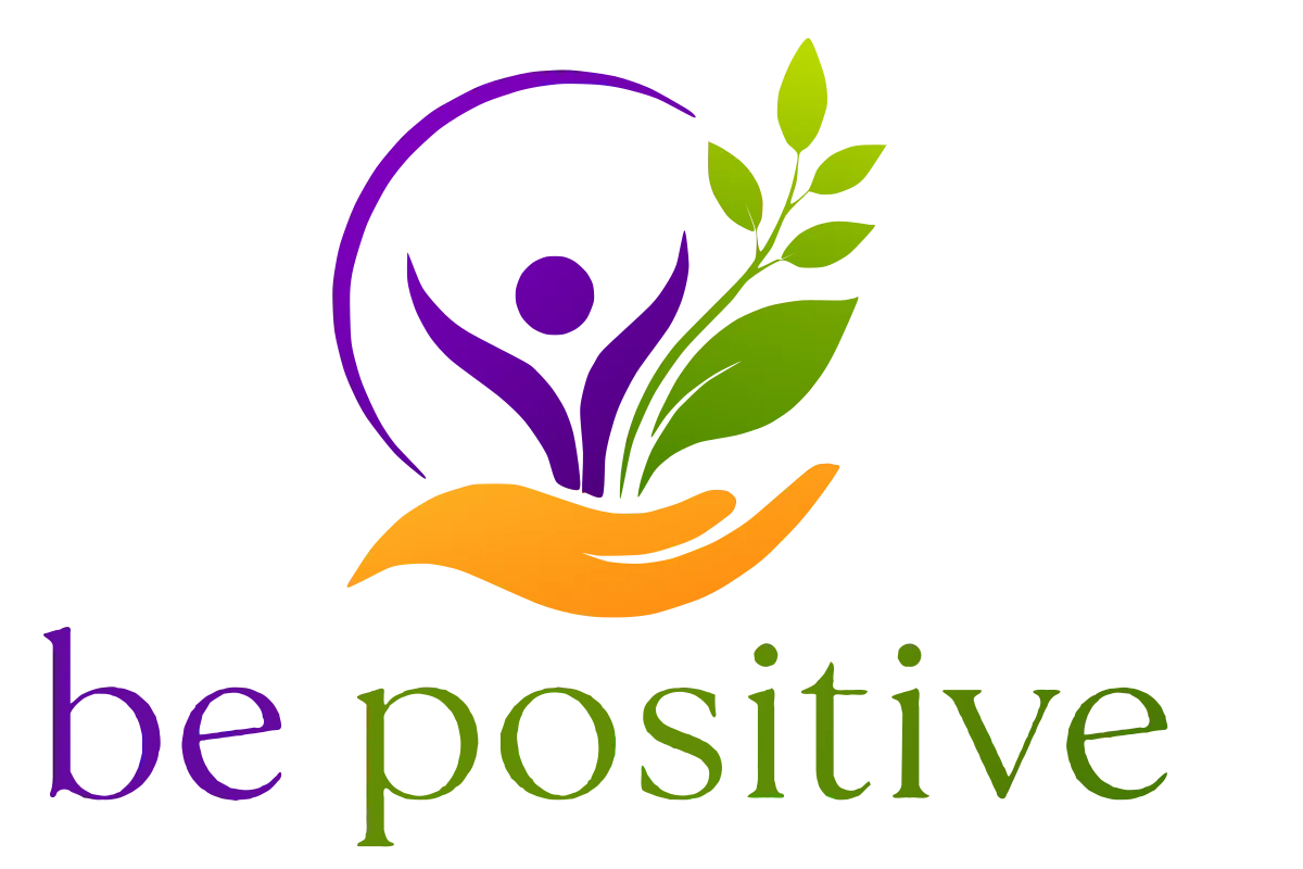
After: The refreshed logo
The name says be positive. The original logo showed a bleeding hand.
It had the right ingredients: an open hand and a growing plant. But red drops ran from where the stem met the palm, as if the seedling had grown out of a wound, and the eye went to the blood before the leaves. For a counselling practice whose clients often arrive already hurting, a wound is the wrong first impression.
Beside the name, the drops could even read as the blood group B positive, more blood bank than counselling. And with no person and no name in it, the logo couldn't say who the practice helps or what it's called.
No more blood
We took out the red drops, and red with them, so nothing in the logo reads as injury or warning.
A person, arms raised
At the centre is a figure with arms raised in joy, held within a sweep of purple: the person the practice is there for, feeling better.
The hand and leaves, kept
The open hand and green leaves stay, so the logo still feels like Be Positive's own. The hand now cradles from below, and the leaves grow upward from care, not from a wound.
The name, built in
The practice's name now sits beneath the mark in purple and green, so the words and the picture say the same thing wherever the logo appears.
Colours with warmth and contrast
We built the palette from the logo's purple, green and orange, set on a warm cream, so the website feels calm and reassuring before anyone reads a word.
Every pairing of text and background is chosen to stay easy to read. An automated test checks each text colour against every background it can sit on, and fails if any pairing drops below 4.5:1, the WCAG AA contrast level for body text.
Purple
Green
Orange
Cream
Ready for everywhere it appears
Wordmark
The full logo above the practice's name, drawn as vectors so it stays sharp at any size.
Logo mark
The figure, leaves and hand on their own, for square spaces such as profiles.
Favicon
A small version that keeps the mark recognisable in a browser tab.
02Website design
A calm place to take the first step
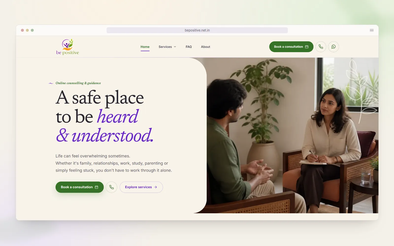
Our website design and development work gave Be Positive a site where someone wondering whether counselling is right for them can read, reflect and take a first step in their own time.
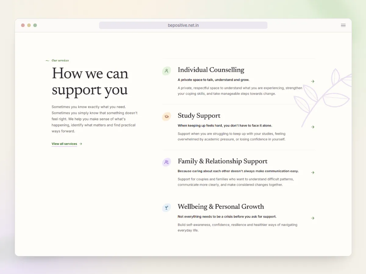
Four clear services
Individual counselling, study support, family and relationship support, and wellbeing, each introduced by a line that speaks to how the reader feels.
Images people can see themselves in
Photos chosen with the people Be Positive supports in mind: individuals, students, couples and families.
Words in the practice's own voice
Calm, respectful language that's easy to understand, with answers to the questions people have before they get in touch.
Care for urgent needs
Every page notes that Be Positive isn't an emergency service and lists the numbers to call for urgent help.
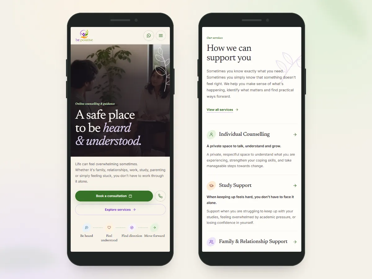
The services section, with botanical details and room around the textThe opening screen and services on a phone
Perfect Lighthouse scores
Lighthouse is Google's own audit of how fast, accessible and well built a page is, and how easily search engines can read it. Be Positive's site scores 100 in all four of its categories.
Performance
100
Accessibility
100
Best practices
100
SEO
100
Client feedback
“We felt heard throughout the process, and they took the time to understand what Be Positive means to us. They helped us create a brand and website we are proud of.”
Before we started, Be Positive's website drew visitors from all over the world. Visits only help a practice when they come from people it can support, so our SEO work focused the site on the areas Be Positive works in.
Before
Visitors from all over the world
Now
98%of visitors come from the areas Be Positive works in
How we focused it
A page for each service
Individual counselling, study support, family and relationship support, and wellbeing each have their own page, titled the way people search for them, such as Online Individual Counselling.
Answers before asking
A page of common questions covers services, appointments, fees, privacy and urgent help, marked up so search engines can read each question and its answer.
Language and region
Every page tells search engines the language and region it's written for, matching the people Be Positive supports.
Structured data
Schema.org markup describes the practice as an online business, with its opening hours and the area it serves. Each service page describes its service, the services page lists all four, and breadcrumbs show where every page sits.
Local details
Opening hours in local time, a local phone number and urgent-help numbers for where its clients live, so the site reads as theirs.
AI tools
Every page is open to search engines and AI crawlers, a sitemap lists them all, and an llms.txt guide summarises the practice and links each service, so tools such as ChatGPT and Claude can point people to the right page.
Visits from people the practice can support are the ones that become genuine enquiries.
04Mobile enquiries
WhatsApp, one tap away
WhatsApp is how Be Positive prefers to hear from new clients, so we made it the easiest way to reach out. Rather than go with the first idea, we tested the options with visitors and kept the one that worked best for them.
How we got there
Listened
Be Positive told us WhatsApp is how it prefers new clients to reach it.
Understood the problem
People decide to get in touch partway through a page, often on a phone. The way to message Be Positive had to be there at that moment, not back at the top.
Brainstormed
We sketched ways to keep WhatsApp within reach, from a floating button in the corner to a bar fixed along the foot of the screen.
A/B tested
For four weeks, half of first-time mobile visitors, chosen at random, saw a floating button and half the sticky bar. Return visitors were left out. We measured what share of contact taps went to the button or bar rather than the page's other contact links.
Settled on the sticky bar
Its share of contact taps was 34% higher than the floating button's, so it became the way to get in touch on phones and tablets.
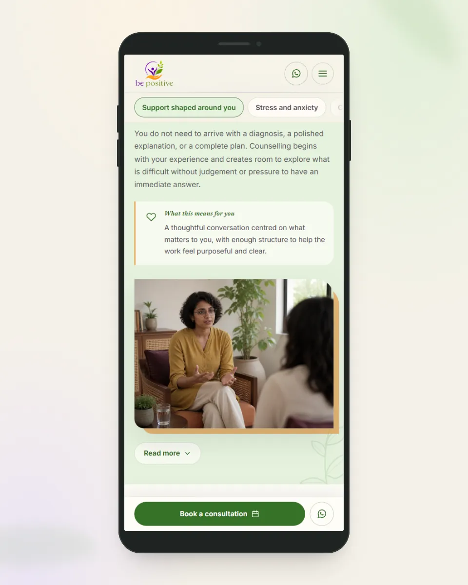
The sticky bar: WhatsApp beside Book a consultation, with WhatsApp in the header too
Why a bar, not a floating button
Tested
A floating button
Floats over the page, covering whatever text sits beneath it.
One small round target, tucked into a corner.
Offers a single way to get in touch.
Chosen
The sticky bar
Sits in its own strip at the foot of the screen.
A wide booking button beside WhatsApp, both within easy reach of a thumb.
Appears once someone scrolls past the opening section, and steps aside at the closing invitation and footer, which offer the same actions.
Today
Today, Be Positive has a refreshed brand, a website that welcomes people the way its counsellors do, and more of the right people getting in touch.
Brand and website for a new Melbourne NDIS provider, from a logo built on the building blocks of life to copy that makes reaching out for support feel easy.
Tell us who you help, where they are and how they like to get in touch. We'll reply with practical next steps, usually within one Australian business day.